Inspiration

Minimalist Design Trends South African Brands Are Using

Minimalist design is not about empty pages. It is about choosing what matters and removing the rest. South African brands are leaning on one strong typeface, plenty of white space and a single accent colour taken from the local landscape.

Below are five studios and type houses whose work shows how this looks in practice. Each one keeps things simple and still feels warm, which suits our market well.

5. Vlei Graphics: Calm Icon Systems

Quiet layouts work because they let the product speak. Clients in Johannesburg and Durban tell us they trust a page that is easy to scan on a phone, with clear prices in rand and one button to press.

Choose fewer fonts, fewer colours and fewer effects. Then make each one count.

A good test is simple. Remove one element from your design and see if anything is lost. If not, leave it out.

Studios in Stellenbosch often start a project by deleting things. Fewer colours, fewer fonts and fewer effects leave more room for the product. Customers notice the calm, and they stay longer on pages that are easy to read on a phone. That is the whole idea. It also loads faster.

4. Helderberg Digital: Quiet Web Layouts

Start with type. A single well-drawn typeface in two weights can carry a whole brand, from the logo to the packaging. Local foundries now draw fonts that suit our languages and our signage.

Then add colour with care. One accent is plenty. Borrow it from the fynbos, the winelands or the Karoo sky, and keep the rest neutral.

Simple design is hard work. Every line, space and colour must earn its place, and the result feels calm, clear and honest to the people who see it every single day.

Studios in Stellenbosch often start a project by deleting things. Fewer colours, fewer fonts and fewer effects leave more room for the product. Customers notice the calm, and they stay longer on pages that are easy to read on a phone. That is the whole idea. It also loads faster.

3. Bosveld Fonts Plain Type

Kaapstad Type Co draws clean, open letterforms that work on a shopfront and on a phone screen. Their sans family is a favourite with start-ups across the Western Cape.

Their licence is simple and covers print, web and social use for one business.

Many of our customers pair it with a plain logo and a single colour. The result looks confident without shouting, and it costs far less than a custom typeface.
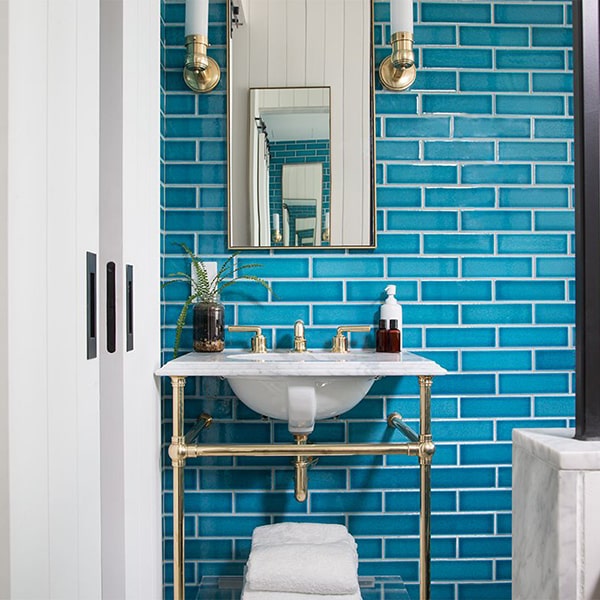
Studios in Stellenbosch often start a project by deleting things. Fewer colours, fewer fonts and fewer effects leave more room for the product. Customers notice the calm, and they stay longer on pages that are easy to read on a phone. That is the whole idea. It also loads faster.

2. Stoep Studio: the Cape Packaging Specialists

Stoep Studio is known for packaging that looks good on a shelf and prints well on a small budget. Their labels use plain grids, honest colours and a lot of breathing room. Designers often download their mockup kits to test ideas before sending anything to the printer in Paarl or Cape Town.

Simple design is hard work. Every line, space and colour must earn its place, and the result feels calm, clear and honest to the people who see it every single day.

Their work proves that a small studio can compete with big agencies. Clear thinking, a good font and a steady hand matter more than expensive software or a long list of tools.

Studios in Stellenbosch often start a project by deleting things. Fewer colours, fewer fonts and fewer effects leave more room for the product. Customers notice the calm, and they stay longer on pages that are easy to read on a phone. That is the whole idea. It also loads faster.

1. Kaapstad Type Co Typefaces

Helderberg Digital builds simple websites for farms, guest houses and small shops around Stellenbosch. Their approach is easy to follow: one clear message per page, big photos and a contact button that is always in reach.

People should know what you sell and how to reach you within five seconds of opening your page.

That rule alone fixes most websites we see. Check your own homepage on a phone, cut the extra words, and make sure your number and WhatsApp link sit near the top. Small changes like this often bring in more enquiries within a week.

Leave a Reply

Your email address will not be published. Required fields are marked *