



Blog
Editing Photos in South African Light: A Preset Guide





Related Posts
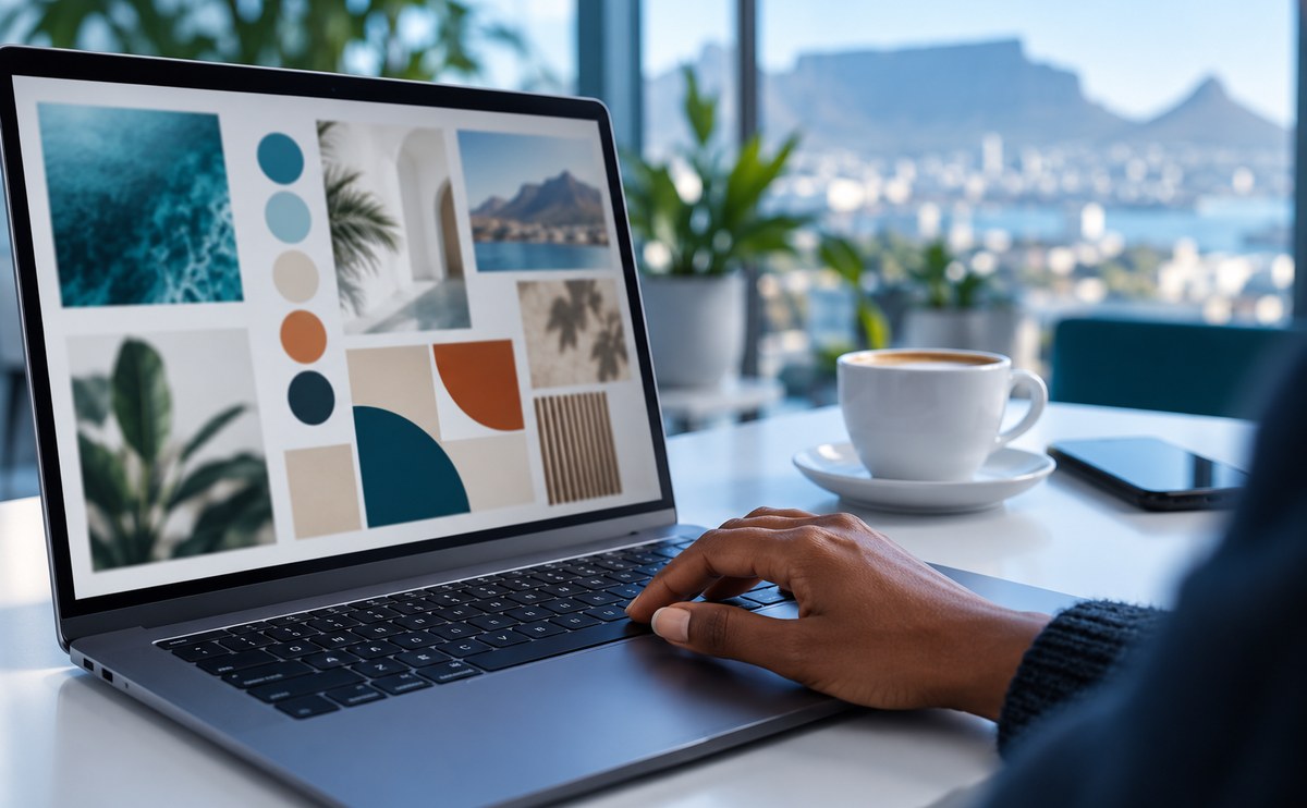
How Cape Town Start-ups Approach Their Brand Identity

Stellenbosch has a small but busy design community. Studios, freelancers and print shops share the same few streets, and many of them s...

How to Build a Portfolio Website That Wins Clients
Fonts shape how a small business feels before anyone reads a word. A serif can feel calm and trusted, while a bold sans feels modern an...

Minimalist Design Trends South African Brands Are Using
Minimalist design is not about empty pages. It is about choosing what matters and removing the rest. South African brands are leaning o...

How to Choose the Right Font for Your Small Business Brand
A good logo file is only the start. Most small brands in Stellenbosch and Cape Town need a full kit: a font pair, a few icons and a cle...
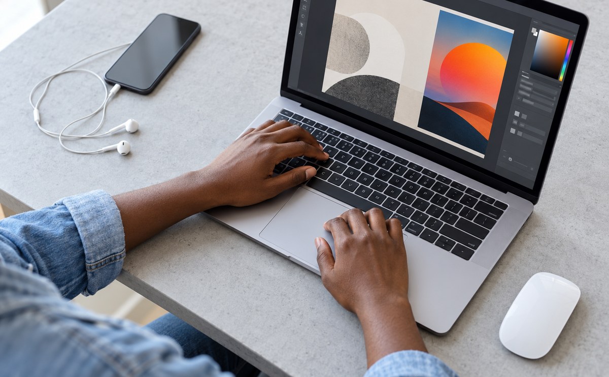
Freelancing in South Africa: Pricing Your Design Work
A clean file is half the job. Before you send anything to a client, check your layers, name your artboards and export a small preview. ...


